Social Media as the Front Door to the Civic Core
Almost no resident starts their day at your website. They start on Facebook. So the practical question for a communications team is not “how do we get engagement” — it is how do we move people from the feed to the places that actually matter: the website, the newsletter, the emergency-alert list, the payment portal, the meeting agenda. We measured how local government does that, across 1,129,040 public Facebook posts from 4,973 city and county governments. Nearly one post in five is holding a door open. And the doors have a price.
- 19.5% of all posts point residents to an owned channel, and 94.7% of governments do it at least sometimes. This is already core practice.
- It is overwhelmingly one door: the website (16.3% of posts). Newsletter (0.90%), alerts (0.70%) and apps (0.27%) are rounding errors by comparison.
- Every door costs reach. Posts that point off-platform run at 0.60× their own page’s median, and 58.6% land below it. Meeting agendas are worst at 0.32×.
- But it is a distribution, not a doom: 25.7% of pointer posts still beat their own page’s median, and some beat it badly.
- The single worst thing you can do is post a bare link with no context — 0.09×. The single best is to put it in a video — 1.02×, the only treatment that reaches parity with an ordinary post.
In this report: Which doors get opened · What a door costs · What earns the cost back · Five approaches that worked · What to do Monday · How we measured this
Which doors get opened
We classified every post by which owned channel it pointed residents toward. The distribution is lopsided in a way worth sitting with.
The website absorbs almost everything. 16.3% of all local-government posts contain a link to a .gov/.us address or a “more info on our website” construction — and 4,626 of 4,973 governments do it. That is the default reflex, and it is nearly universal.
The channels that actually build a durable, algorithm-proof relationship with residents are the ones barely used. The newsletter appears in 0.90% of posts. Text and emergency alerts appear in 0.70%. A mobile app: 0.27%. Put differently, for every post that asks a resident to join an emergency-alert list, there are 23 that send them to a web page.
That imbalance is the strategic story. A website visit is a one-time event that the next algorithm change can erase. An alert subscription is a permanent, direct line into a resident’s pocket — the thing you need on the night of the boil-water notice, when Facebook’s reach is not yours to control. Governments are pointing at the transient door far more often than the durable one.
What a door costs
Now the uncomfortable part, and the reason this is worth measuring rather than assuming. We compared every pointer post to its own government’s median post — same page, same followers, same community — so page size and general competence are controlled for.
Every single door underperforms. The median pointer post earns 0.60× what that same government’s typical post earns, and 58.6% of them land below their own page’s median. Meeting agendas and livestream links are the weakest content in local government that we have measured — 0.32×, with only 11.4% beating their page.
What earns the cost back
Within pointer posts, the spread between the best and worst approaches is far larger than the penalty itself. This is the most actionable chart in the report.
Four findings worth pinning above a desk:
- The bare link is a catastrophe. Pointer posts under 160 characters — a URL and little else — run at 0.09×. That is not a penalty; that is a post nobody sees. Length rises monotonically with performance: under 160 characters, 0.09×; 400–800, 0.53×; over 1,500, 0.67×. The post has to be worth reading on its own, even if you hope the reader leaves.
- Video is the only route to parity. Pointer posts published as video run at 1.02× — they cost essentially nothing in reach. Every other treatment stays underwater. This matches our separate finding that video earns 2–3× generally: it is strong enough to absorb the link penalty entirely.
- Write like a person. Posts using “we,” “our,” “you,” “your” run 0.65× against 0.54× for those that do not — a 20% improvement from pronouns alone.
- Urgency framing backfires. Counter to instinct, posts leaning on “deadline,” “last day,” “apply by” run 0.47×, well below the 0.60× pointer average. Manufactured urgency reads as pressure. Real urgency is different: posts attached to an actual emergency run 0.67×.
Five approaches that worked
These are real posts, screenshotted from Facebook’s public embed. Each illustrates a different, repeatable move, and each figure quoted is the one the post itself displays. We describe only what is visible in the screenshot — click through to read any of them in full.
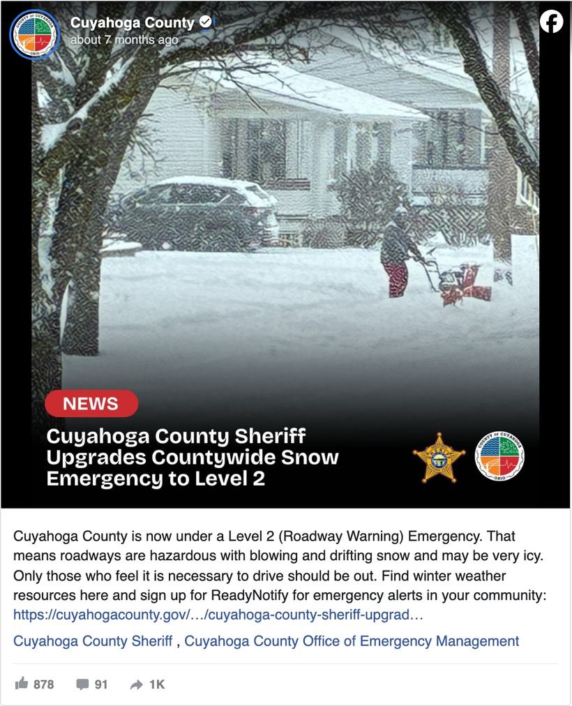
Cuyahoga County, Ohio declared a Level 2 roadway emergency, explained in plain language what it meant for drivers, and then — in the same breath — asked residents to “sign up for ReadyNotify for emergency alerts in your community.” It earned 878 reactions, 91 comments and about 1,000 shares. The signup is not the pitch; the road conditions are. The subscription rides along with information residents urgently need right now, which is the only moment the value of an alert system is self-evident.
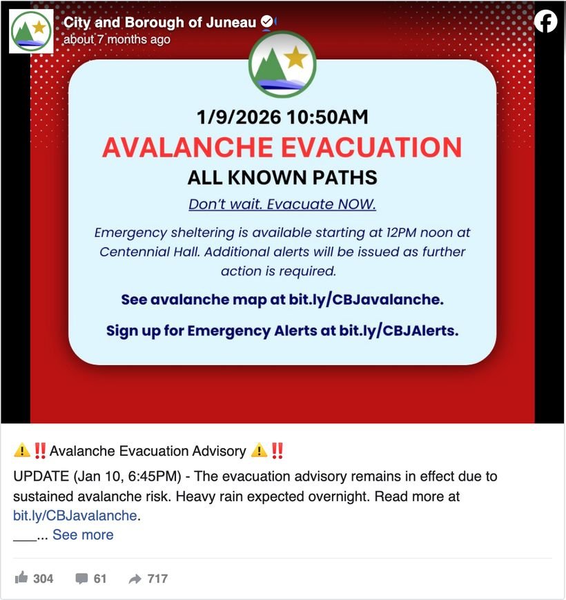
Juneau, Alaska’s avalanche evacuation update carries the status in the post and sends residents to the borough’s own avalanche page for the rest: 717 shares against 304 reactions — more forwarding than liking, the signature of information people push to their neighbors rather than merely approve of. This is the 0.67× emergency lift at its upper end. Nobody resents a link when they need what is behind it.
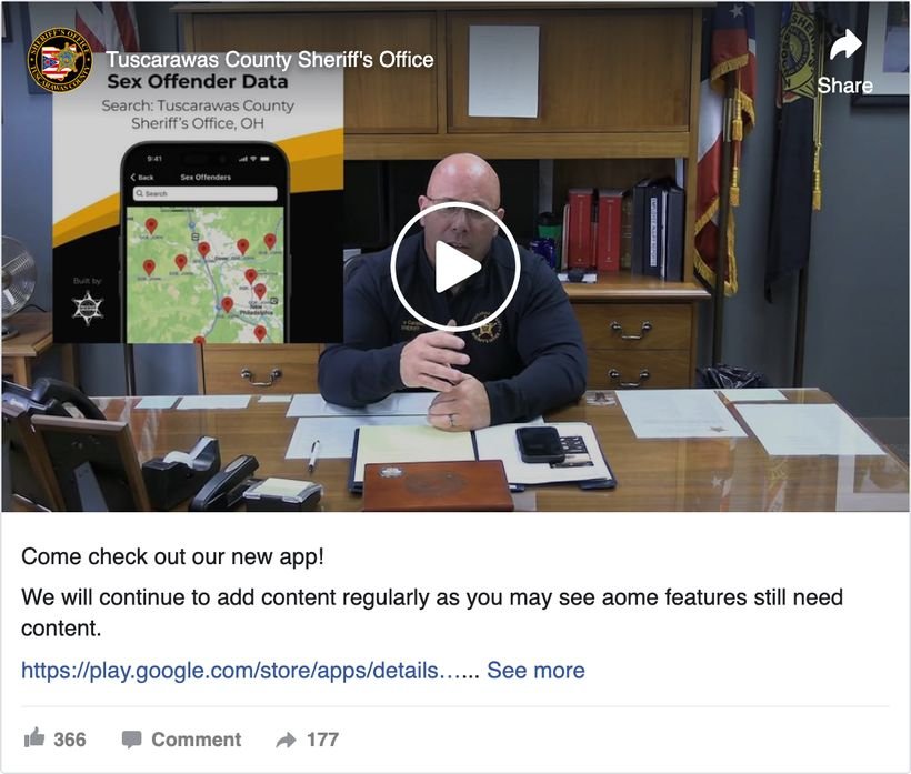
The Tuscarawas County, Ohio Sheriff’s Office announced its new app the hard way and the right way: a uniformed officer at his own desk, on video, with the app demonstrated on screen doing something specific — a searchable county map. 366 reactions and 177 shares for what is, underneath, an app-store link. This is the strongest lever in our data (video, at 1.02×) applied to the weakest-performing channel (apps, at 0.40×).

“That park making the rounds online? It’s Gateway Park, and it’s right here in Union City” — Georgia. Three paragraphs about what the park will be, and only then: “Sign up for our newsletter to be the first to get updates on the grand opening.” 318 reactions and 33 comments on a page whose median post earns 5. The newsletter ask is the last sentence, never the first — and it arrives when residents have just been given a reason to want more.
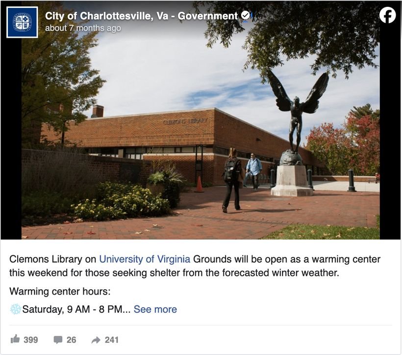
Charlottesville, Virginia’s warming-center post does not point residents to a page at all. The location, the reason and the full hours are in the post: 399 reactions and 241 shares against a page median of 6. This is the necessary counterweight to everything else here. A door costs reach, so open one only when what is behind it will not fit in the post. Somewhere warm to sleep on Saturday fits in the post.
Two more worth reading in full.
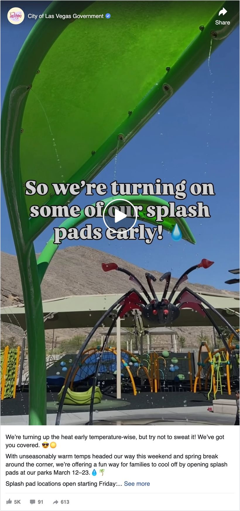
A video announcing splash pads opening early for unseasonably warm temperatures, with the locations pointer after the hook: 5K reactions, 91 comments, 613 shares. This is the 1.02× video finding in its natural habitat — the ask does not depress the post, because the post is not primarily an ask.
View on Facebook →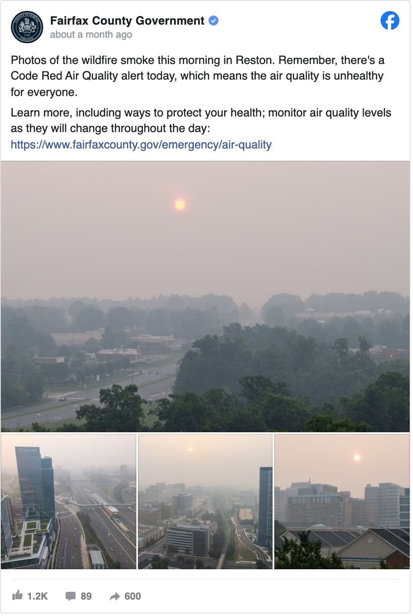
Photos of the smoke over Reston, a plain-language explanation of what a Code Red air-quality alert means, and only then the county page for how to protect your health: 1.2K reactions, 89 comments, 600 shares. The post does the explaining itself rather than making the click a prerequisite for understanding — which is why people forwarded it.
View on Facebook →The thread running through all seven: not one of them is a post about a channel. They are posts about a snowstorm, an avalanche, an officer, a park, a warm bed, a splash pad and the smoke over Reston — and the door, where there is one, is what the post hands you on the way out. The pointer posts that fail are, almost without exception, posts about the channel itself.
What to do Monday
- Stop posting bare links. At 0.09×, a URL with a sentence attached is the worst-performing thing in this dataset. If a link is worth posting, it is worth 150 words explaining why. If it is not worth 150 words, it probably is not worth posting.
- Rebalance toward the durable doors. You currently point at the website 23 times for every once you point at an alert list. The website visit ends when the tab closes; the alert subscription is still there during the next ice storm. Set a ratio you can live with and track it.
- Recruit during the emergency, not after it. Alert-signup posts attached to a live event run 0.50× against 0.39× for routine ones, and the standout examples above are all mid-event. The storm is your best recruiting campaign; have the signup line ready to paste before it starts.
- Film the ask. Video is the only treatment that eliminates the link penalty entirely. Thirty seconds of a real staff member explaining the alert system will outperform any graphic you can make.
- Cut the manufactured urgency. “Deadline” and “last day” framings run 0.47×. Say what the thing does for the resident instead of how soon it expires.
- Judge these posts on conversion, not likes. This whole report measures public engagement, which is the wrong metric for a pointer post and the only one visible from outside. You have the right one: put a UTM on the link, watch signups on the day you post, and let a low-engagement post that added 60 subscribers count as the win it is.
How we measured this
Every number comes from public posts any resident could see.
.gov links, newsletter and email lists, text and emergency-alert systems (including CodeRED, Nixle, Everbridge, Smart911 and Reverse 911 by name), mobile apps, online portals and self-service, and agendas/meetings/livestreams. Categories overlap; 19.5% of posts matched at least one. Engagement figures use the 899,343 posts with measured public engagement, and within-page comparisons index each post to its own government’s median non-pointer post, restricted to pages with 30+ measured posts (n = 175,700). We report medians because engagement is heavily skewed. The central limitation is unavoidable and worth stating twice: we can see engagement, not clicks. A post that quietly delivered 200 newsletter signups looks identical here to one that delivered none, so every figure in this report is a measure of reach, not of conversion — treat the penalties as the price of the ask, not as proof the ask failed. Keyword matching also misses pointers phrased in ways we did not anticipate, so counts are a floor. This is observational: governments choose when to point residents somewhere, and those choices correlate with post type. Case-study screenshots are Facebook’s public embed renderings captured in August 2026, and the figures quoted for individual posts are the ones the live post displays. Data pulled fresh from our production pipeline on 18 August 2026.
Frequently asked questions
Do links hurt engagement on local-government Facebook posts?
Yes, measurably. Posts pointing residents to an owned channel run at 0.60× their own government’s median post, and 58.6% land below it. But the penalty varies enormously by execution: a bare link with no context runs 0.09×, while the same ask inside a video runs 1.02× — essentially no penalty at all. The link is not the problem; the empty post around it is.
How often do local governments promote their newsletter or alert system on Facebook?
Rarely. Across 1.1 million posts, newsletters and email lists appear in 0.90% and text/emergency alerts in 0.70% — against 16.3% for website links. For every post asking residents to join an emergency-alert list, there are about 23 sending them to a web page. Nearly every government (94.7%) points somewhere at least sometimes; the imbalance is in which door.
What is the best way to get residents to sign up for emergency alerts?
Ask during an actual emergency. Alert-signup posts attached to a live event run 0.50× own-page median versus 0.39× for routine ones. The clearest example in our data is Cuyahoga County, Ohio: a Level 2 roadway emergency explained in plain language, with “sign up for ReadyNotify for emergency alerts” in the same breath — 878 reactions and about 1,000 shares. The pattern to copy is that the signup rides along with information residents urgently need, rather than being the point of the post. Video helps more than any other format (1.02× versus 0.60× for pointer posts generally), and a bare link with no context is the worst thing you can do, at 0.09×.
Which owned channel do local governments point to most?
The website, by a wide margin: 16.3% of all posts, used by 4,626 of 4,973 governments. Then agendas and meetings (2.98%), online portals (1.03%), newsletters (0.90%), text and emergency alerts (0.70%), and mobile apps (0.27%). Meeting and agenda links are also the weakest-performing content we measure, at 0.32× own-page median.
Read the version that already worked somewhere.
Search how 5,000+ peer governments word the ask — by keyword, state, and population band.
“An exceptional way for people to look for ideas and comparisons.”